
Summary
I proposed and led the initiative to build our design library from scratch, defining the structure, naming conventions, templates, and workflow, and aligning leadership on roadmap and timelines.
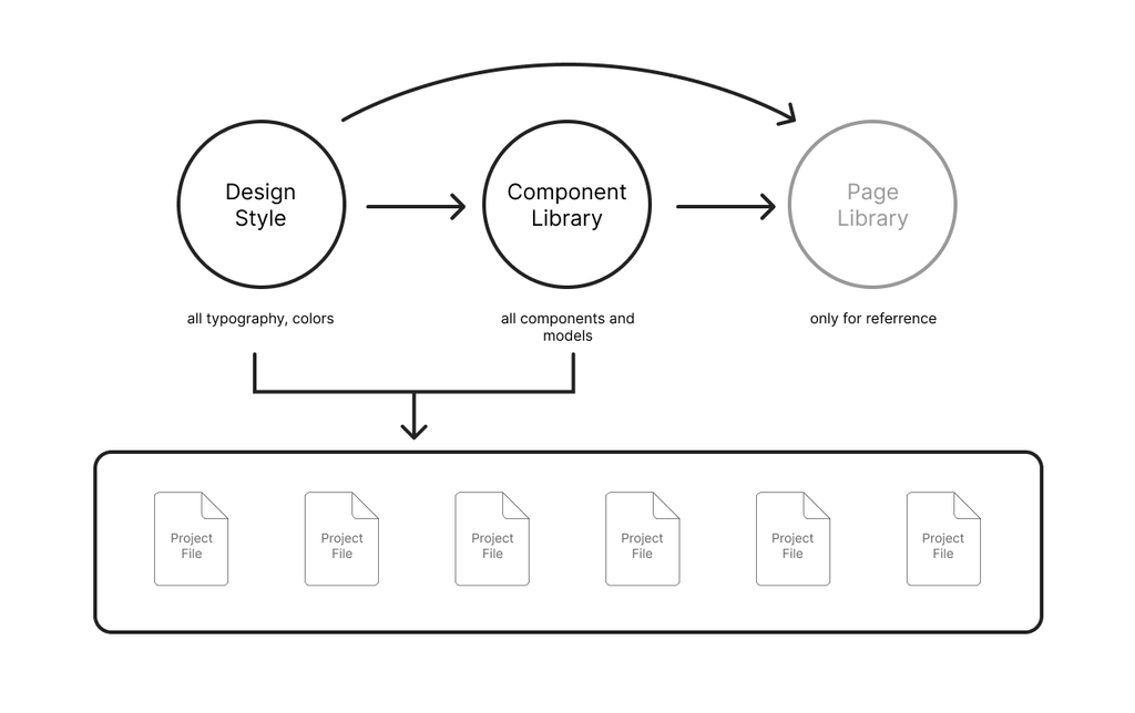
We delivered a connected three-file system and used it to reorganize all design files inherited from the KR team:
- Design Style (foundations like typography & color)
- Component Library (components + guideline docs)
- Page Library (Internal) (real usage examples for designers)
Context & Background (Why)
Even though the service had launched years earlier, we still didn’t have any official design or component guidelines. As a result, we repeatedly ran into the same questions:
- In design reviews: “Where did this component come from?” “I saw something similar before where was it?” “What’s the correct way to use this component?”
- During development: “Will we reuse this component?” “Can we tweak it and reuse something from Project XXX?” “Why is there a new color here?”
These issues created avoidable back-and-forth. Because we were also bridging between KR designers and TW developers, we often had to repeat the same clarifications twice.
After we took over the KR design files in 2024, we realized the root cause was structural: there was no internal component library in active use. At the same time, we wanted to avoid managing assets in multiple places long-term, especially when we were already dealing with parallel files from KR UX and UI teams. That made it the right moment to establish a structured library system.
My Role
I was the original proposer and the owner of the overall direction of the library initiative. My responsibilities included:
- Defining how many libraries we needed and what each one should contain
- Establishing file naming conventions, file production standards, and templates
- Setting the roadmap, milestones, and timelines
- Reporting progress and future direction to leadership so they could clearly see what the design team was building and why
Approach (What we built)
We designed the library as three connected files, each with a clear purpose and audience:
- Design Style
- The smallest atomic foundations: typography, color, and other base styles.
- The goal was to ensure every product surface referenced the same source-of-truth styles.
- Component Library
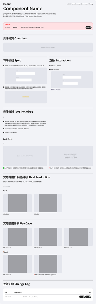
- The home of all components and the guideline documents that explain usage.
- This was the shared reference for designers, developers, and PMs.
- Page Library (Internal)
- An internal-only library that collected real examples of how components had been used before.
- It helped designers quickly find “proven patterns” and reduce rework.
After we established this structure, all design files we inherited from KR were reorganized and rebuilt through these three libraries, so that foundations, components, and real usage examples were consistently linked.
Example: from “random colors” to tokens
Before the library existed, we ran into situations like having two nearly identical colors (e.g., #222222 and #232323) used across different pages and projects. This made it hard to answer basic questions:
- Which one is the “real” primary color?
- Which one should be kept?
- How do we name them so the whole team can use them consistently?
After organizing the library, we moved to a token-based approach. Instead of seeing raw hex values scattered across files, designers would see pages already applying a Primary color token, and the system would clearly show the mapping (e.g., Primary = #222222). That changed the conversation from “Which hex is correct?” to “Which token should we use?”
Key decisions & governance lessons
Naming and structure are not “cosmetic”—they are operational
Because our content came from existing pages and models, we intentionally avoided large visual changes at first. That made naming and organization even more important: without clear structure, we would have recreated the same chaos inside a new file.
Ownership and admin discussions matter early
We spent significant time aligning with IT on what the guideline should be. IT’s expectation was closer to Apple’s Human Interface Guidelines—something that would directly provide front-end code for daily use. From the design team’s perspective, our initial goal was communication efficiency and consistency, not immediately forcing design language to match developer language.
We agreed to focus on building a reliable library first, while capturing developer notes (e.g., OS limitations) to reduce gaps between documentation and implementation.