
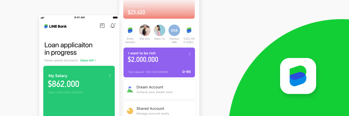
Overview
Project Name: Top page revamp
Schedule: 2024–2026 (unfinished at the time I left)
Role: Project owner, lead designer, UX designer, and UI concept designer (until I left the project in 2026)
Intro
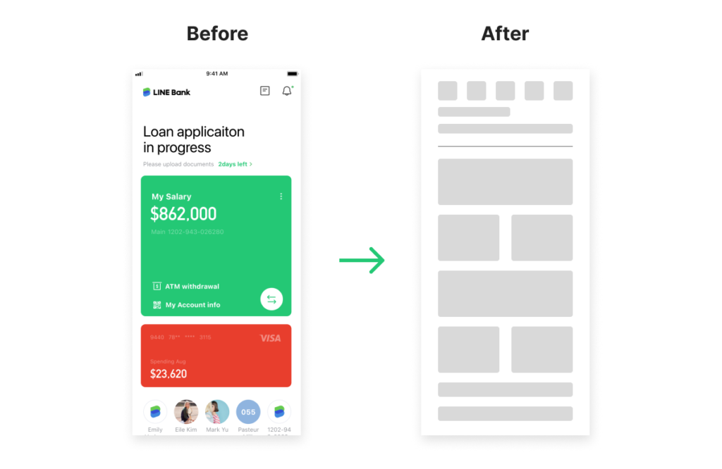
During the three years following the bank’s launch, we identified many problems and misalignments between user needs and business priorities. We continuously collected these issues through our day-to-day project work. One of the biggest issues was the number of API calls required to load the top page, which resulted in long loading times for users. In 2024, a user reported that the top page appeared empty and took more than five minutes to load. This incident prompted the CEO and business team to initiate the revamp project. After the decision was made, I reviewed the issues we had encountered, aligned the team on our future goals, and led the project from internal research through cross-functional meetings as the project owner and lead designer.
Approach
After discussions with C-level stakeholders, we officially kicked off the revamp project. We requested the resources and data we needed from leadership and defined the following steps from the beginning:
- Research
- Problem framing
- Concept development
- Feasibility and delivery
*This case study focuses on the project through the concept alignment stage. Feasibility evaluation and delivery were still in progress when I left the project.
Step 1. Research
Based on this plan, we began with design research. After internal discussions within the design team, we identified three key topics:
- User data (to validate uncertain assumptions)
- Internal workshop (to understand each team’s priorities)
- Competitive analysis (banking and financial apps)
User data
Key finding
The data challenged our assumption that users had to scroll extensively to achieve their goals. In reality, most LINE Bank users had no more than three accounts. We also found that users had adapted by tapping the bottom cards after trying several paths. This raised another question: should we preserve this user habit, even though it was not our original intention?
Internal workshop
We prepared four questions for participants to encourage deeper discussion:
- Three pain points you encountered while using the app.
- Three pain points you encountered while working on the app.
- Any banking apps you like besides ours, and why?
- If you were the owner of the revamp project, what topics would you add?
Key finding
The workshop revealed that different teams were optimizing for different outcomes: users wanted faster access, business teams wanted stronger product visibility, and engineering teams wanted fewer API dependencies. We used these tensions to define the design principles for the next phase.

Competitive analysis
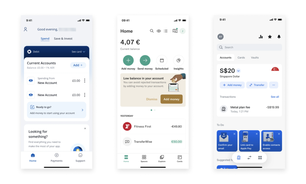
We researched specific features in banking apps from countries with more mature fintech industries, including South Korea, the UK, and Hong Kong.
Key findings
- To address the “salary account” issue, South Korea and the UK have solutions that allow multiple bank accounts to be synced and managed within a single banking app. For example, even if a user opens an account at Bank B, they can transfer, manage, and view it through Bank A’s app. This allows people to manage their finances through a single app. However, due to Taiwan’s regulations and market conditions, we could not offer this service at the time. Although we understood the potential value of this solution, we also saw a clear gap between what Taiwanese users could benefit from and what we could legally provide.
- Showing or hiding balances is an important and common feature for Taiwanese users because many people prefer to protect their financial privacy when using the app in public. In South Korea and some other countries, however, this feature is not consistently offered across banking apps.
- In Taiwan, many users choose their primary bank based on where their salary is deposited, which is usually determined by their employer. This means users do not always choose the bank with the best user experience or convenience; instead, they adapt to the bank chosen by their employer. This raised an important question: how might we break this habit and attract more users?
Step 2. Problem framing
After the research, we narrowed our focus to a central question:
How might we redesign the banking app’s top page so users can quickly understand their financial status and access important actions, while keeping the experience technically feasible and aligned with business and regulatory constraints?
Based on this question, we framed the challenge from three perspectives:
- User challenge: Help users check their financial status quickly and complete important tasks efficiently.
- Business challenge: Balance different business strategies and objectives.
- System challenge (highest priority): Reduce API calls and improve system efficiency.
Step 3. Concept development
Based on the research and internal requirements, we realized that balancing the needs of users, stakeholders, the system, and leadership would be challenging. To explore different possibilities, another designer and I collaborated on developing design concepts.
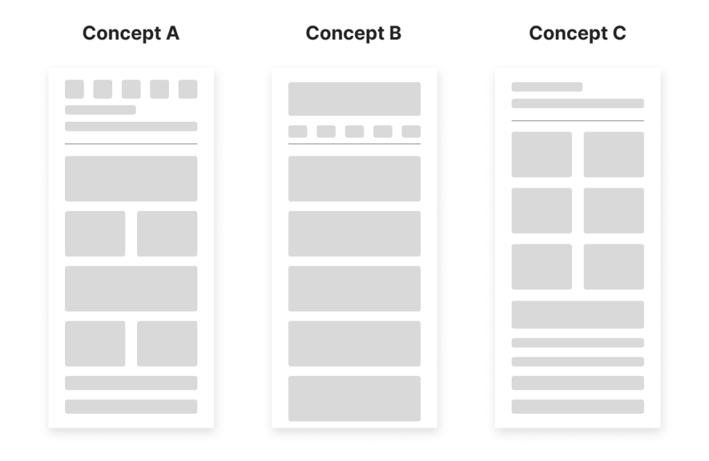
Concept A (my proposal): Subpages for each product
Advantages: For users, this structure would make all products visible at a glance and allow them to enter a product page with a single tap to check their asset status. For the business, each product could have a dedicated subpage with its own visual treatment. For the system, only the relevant product data would need to be loaded once a user entered a tab.
Risks: The design would be more complex because each tab and product would require additional coordination between departments and the design team. It would also be difficult to determine the order of the tabs because each team considered its own product a top priority for users and the company.
Concept B: One page with all products
Advantages: Users could focus on their total asset balance first and see the status of their most frequently used products if they customized the order of the products.
Risks: The business would have limited space to present its products. From a system perspective, we would need another solution to avoid loading all the data at once, since a single page would contain a large amount of information and asset data.
Concept C: One page with assets only
Advantages: This would directly address users’ primary need to view their assets in the banking app. It would also significantly reduce the amount of data requiring API calls. This was the most user-centered solution.
Risks: The business would have no way to promote its products before users owned them. The system would also need to identify which assets each user owned before displaying them.
Final direction
To move forward, we presented the concepts to C-level stakeholders and aligned on the advantages and risks of each direction. After discussion, we chose Concept A because it addressed all three goals while keeping its risks manageable.
*Because of the confidentiality agreement, I cannot share the designs or detailed information from this point onward.
Notes
Impact at the point I left
Although the revamp had not launched when I left the project, the work had already created several tangible outcomes:
- Aligned the product, business, engineering, and leadership teams around a shared problem definition and three design priorities: user access, business visibility, and system efficiency.
- Shifted the discussion from simply adding more content to balancing user needs, business goals, and system constraints.
- Established Concept A as the preferred design direction for the next phase.
- Provided the engineering and data teams with a clearer basis for evaluating feasibility and preparing the necessary tracking instrumentation.
What I learned
Because the project was still in progress when I left, I do not claim a final product outcome or measurable business impact. The following lessons reflect what I learned from the work completed up to that point.
- In this project, users, business teams, engineering teams, and leadership did not share the same definition of what a “better top page” should be. I learned that stakeholder alignment is not a separate step before design—it is part of the design work itself.
- Working on one of the most important and visible screens, I quickly realized how many trade-offs and problems came with it. I learned that it was important to align stakeholders early, help them find common ground, and bring people with different opinions into the same conversation to clarify priorities.
- Even with an existing design language and component library, there are many moments where you need to decide whether to extend existing components or introduce new ones. These decisions are especially difficult when other projects are running in parallel—because a small choice today can have long-term impact years later.
What I would validate next
I would use the following metrics and research questions to evaluate the project after launch:
- Top-page loading time and API request volume
- Task completion rate for key account actions
- Whether users understand the new information hierarchy
- Whether business teams can maintain the new content structure
- Whether the component library can support future product expansion
We discussed these measures throughout the project. During development, the data and engineering teams were also preparing the necessary tracking instrumentation so that we could evaluate them after launch.