
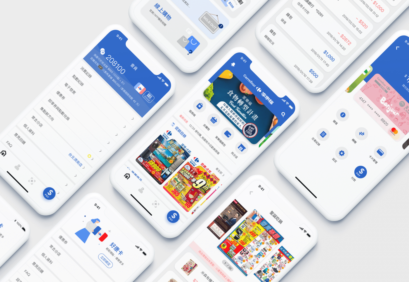
*Carrefour Taiwan app was stopped service in 2026, due to ownership changed from Carrefour France to Uni-President Taiwan.
Background
Our client is one of the world’s leading hypermarket brands. Although it operates in Taiwan as a foreign-owned company, it has built deep local roots over nearly three decades.
At these days, the brand has expanded to more than 100 stores, in two formats: large hypermarkets and 24-hour convenience-style stores. The business continues to grow, and it has also collaborated with local partners to help them sell their products.
At the same time, Taiwan’s retail landscape has been rapidly shifting as consumers increasingly rely on technology in daily life. As digital requirements rises, demand for digital retail experiences has grown accordingly. In response to this market shift, the client set out to fully integrate online and offline retail into a seamless end-to-end experience.
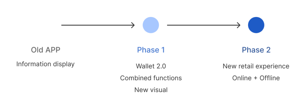
The project was structured in two phases:
Phase 1: Merge the two existing apps and redesign them for a more cohesive, improved experience.
Phase 2: Launch a revamped, more native e-commerce experience.
Why redesign needed?
As mentioned above, both consumers and the market in Taiwan have been moving quickly toward digital. From small boba-tea shops to large hypermarkets and department stores, many brands have launched their own apps to strengthen digital capabilities and increase customer retention and loyalty.
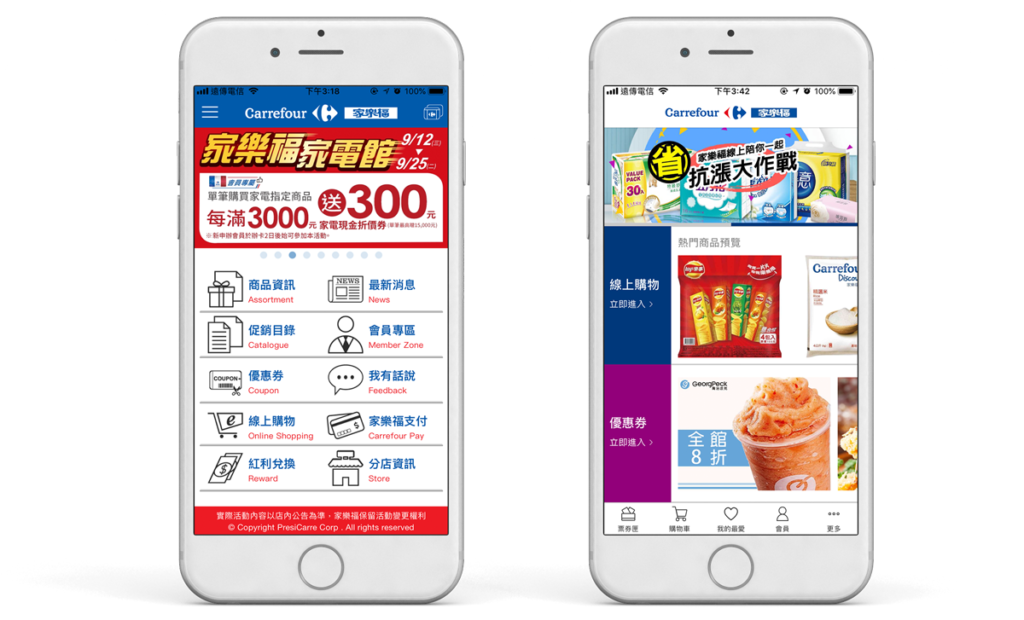
This client already had two long-running apps:
- One primarily served online shoppers for e-commerce purchasing (web-based experience).
- The other focused on offline customers, functioning as a marketing and member-service app.
The primary goal of the first redesign was to merge these two apps to unify online and offline services. Another key focus was introducing features aligned with “new retail” trends—such as a wallet and scan-and-go shopping.
From a UI perspective, the previous app was more focused on information display. The home screen presented the top ten functions in a grid, which didn’t support marketing needs. All these limitations became a major part of the redesign.
Role
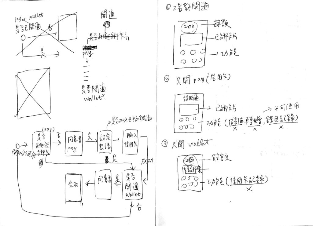
UX (partial features): Clarified requirements, validated logic, produced user flows. I primarily owned the end-to-end planning for the new wallet flow, participated in interaction design across the app, improved overall usability, and addressed core pain points in the legacy experience.
UI (end-to-end): Built a refreshed design system based on the client’s brand guidelines, using visual design to improve user satisfaction and strengthen brand loyalty—while delivering a distinctly new visual experience through the redesign.
Insights
Through competitor analysis, stakeholder alignment, and requirement discussions, we established a set of design principles that were repeatedly referenced throughout the project. They served as a shared north star for feature decisions and trade-offs.
- New retail as an integrated ecosystem:
The retail industry has moved from an e-commerce era into a “new retail” era. As Alibaba defines it: “a data-driven omni-retail model centered on consumer experience.” To truly achieve “omni,” we needed to consider business logic and system architecture across multiple dimensions.
Since the client’s offline operations were already mature (store services, logistics, etc.), there was still significant room to scale and improve online retail. Our first priority was to elevate online service quality and scale, and connect it with offline services to form a more complete loop around users and data.
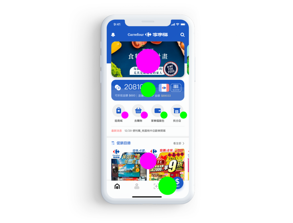
In Phase 1, the home screen emphasized membership services and the wallet to reflect the offline-service integration focus. When Phase 2 introduced online shopping, we did not deprioritize offline services; instead, we rebalanced the layout and information hierarchy so users could access both online and offline functions quickly from the same screen.
- Usable information
Based on the client’s research, the majority of users were married women aged 30–50. Early on, the client emphasized designing around these users’ habits. Compared to younger users who may prioritize speed and novelty, this group tends to value stability and practicality—such as readable prompts, detailed discount information, and system reliability.
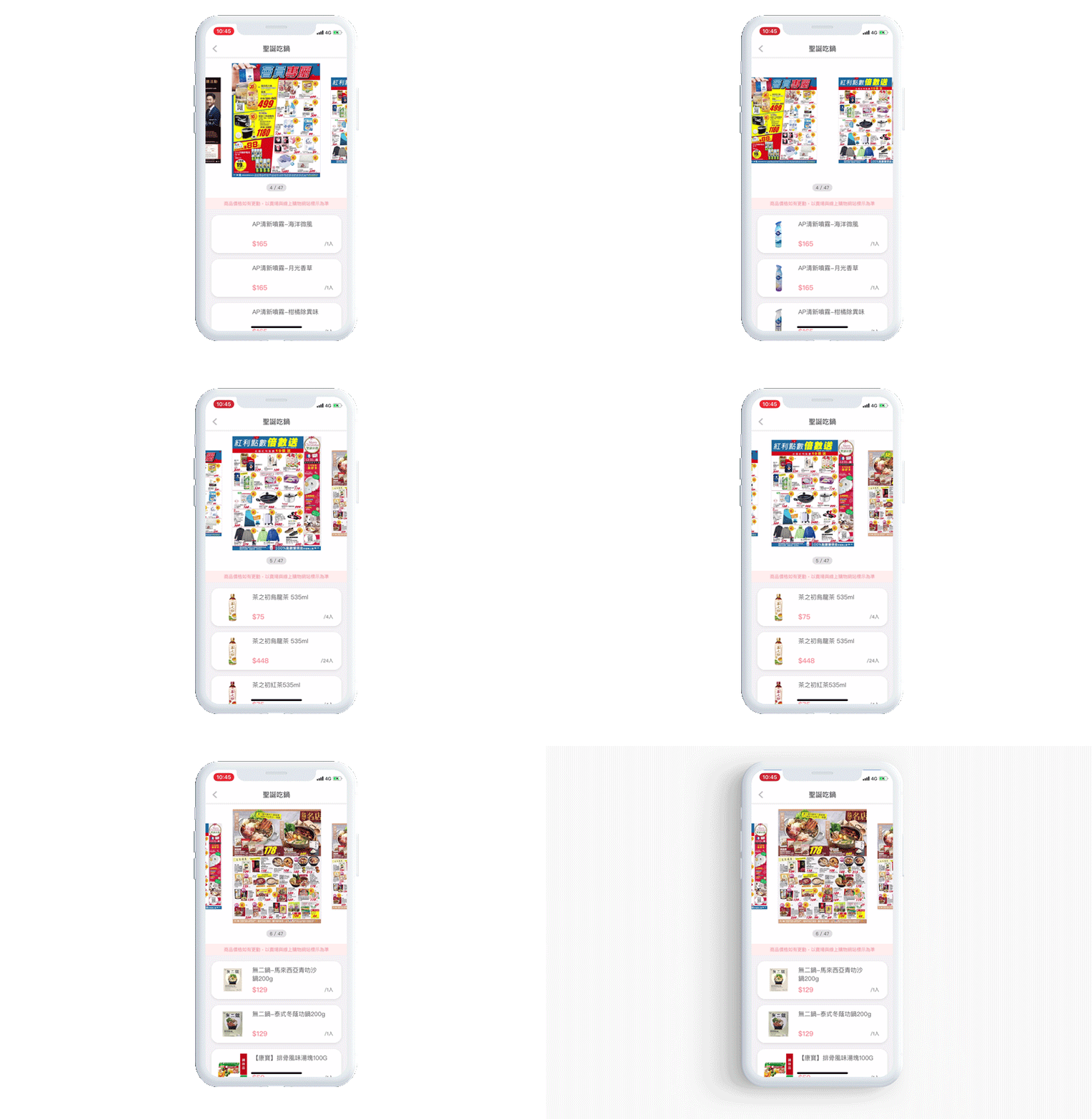
For example, the old promotions catalog only supported page-by-page browsing. In the redesign, we added the featured products listed beneath each catalog page, serving both users who prefer browsing and those who want to quickly identify relevant deals.
- Intuitive operation
Because the redesign would significantly change the interface, existing users would inevitably face an adjustment period. For new features especially, we aimed to reduce cognitive load by making interactions more intuitive—so users could complete tasks smoothly with minimal learning curve.
Challenges
- System constraints
Throughout design and development, we encountered multiple long-running systems. The client did not plan to optimize these systems at this project, so the new app often had to adapt to existing limitations. From a UX standpoint, we still aimed to achieve the best experience within constraints by adding guidance, clear messages, and thoughtful flow to help users well understand unavoidable issues.
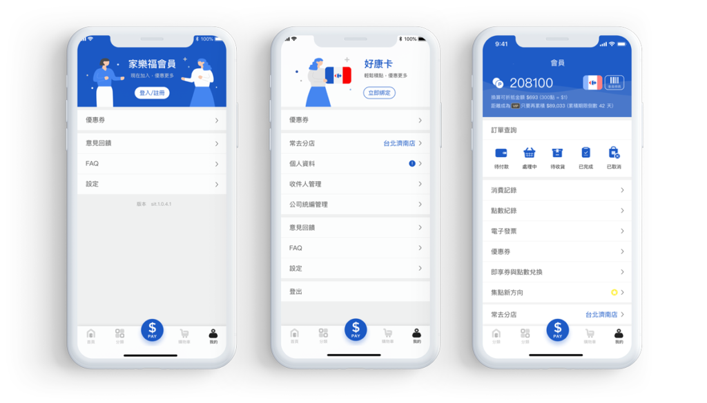
For example, the membership program existed in two separate systems for online vs. offline due to historical differences. Without explicit explanation, users couldn’t easily understand why there were two different membership accounts. Because the systems could not yet be unified, we proposed optimizing login and registration flows to improve this situation—guiding new users through a continuous, uninterrupted journey that helped them quickly register both accounts.
- Integrating multiple data sources
The client worked with many external vendors, and some features required integration with more systems simultaneously, this made creating added complexity at the information architecture level.
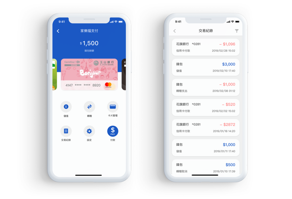
For example, the wallet feature involved both a top-up vendor and partner banks. In screens like transaction history, data came from multiple systems but needed to be presented as one view. This required careful consolidation and structuring so users could clearly understand all information without inconvenience.
UI highlights
The visual update was substantial. The brand colors from Carrefour are blue and red, but giving both equal weight might created a visually “noisy” experience. During the proposal stage, we presented two color-direction concepts with different primary color emphasis. Ultimately, we chose blue as the primary color, since red felt too close to competitors, using red as an accent.
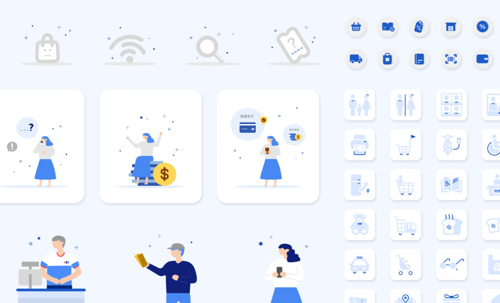
Additionally, the brand’s original blue was relatively deep and heavy. We worked with the client to slightly increase saturation and brightness. From a color psychology perspective, blue conveys calmness and comfort, which aligned well with the brand’s “warm hospitality” values. We also proposed using large rounded shapes and friendly illustrations to soften the look and enhance approachability.
The legacy app was largely information-driven and lacked a sense of interaction and delight. To address this, we also introduced motion elements and animations in the new app to create a more engaging experience.
Conclusion
Phase 1 launched in June 2019, and Phase 2 introduced online shopping features in January 2020. On Android, downloads increased from 200,000 to 425,000, and the rating improved from 2.2 to 4.4.
Throughout the project, we navigated ongoing communication and system challenges, as well as many iterations and refinements at a detailed level. Since the scope did not include formal user testing or interviews, we mainly relied on stakeholder feedback and app store reviews, making it difficult to capture comprehensive performance metrics. Even so, we tried lightweight approaches to gather more immediate insight: talking to users around us, conducting in-store observation near the service counter, and checking in with customer service teams to learn from frontline feedback.
While some constraints remained unresolved, both the client and our team shared the belief that the product should keep evolving—continuously improving the experience and delivering a more convenient and modern “new retail” journey for users.