
Summary
LINE Bank’s first investment product — a regulation-heavy launch across three platforms, completed on time with no major issues.
Context
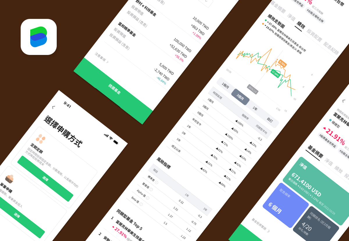
To meet our business strategy and annual targets, our CEO and stakeholders explored a new way to help users stay engaged and enjoy investment tools in LINE Bank—without a stock-trading license. After collaborating with a securities company on the Settlement Account, LINE Bank shifted focus to Mutual Funds: a mature investment product in Taiwan with a lower entry barrier for beginners.
Another part of the story: another teammate and I took over the project from two members in the preparation phase. They had completed most of the research and studies, plus part of the PRD, and then handed the project to us. That made the start challenging—we had to quickly sort out what was done, what was pending, and what problems still needed to be solved.
Taking over mid-project, my first job as Planner was to quickly reframe the challenge for the team: ship a fully new, regulation-heavy financial product—on time, across three platforms, with no existing component library to build on.
Constraints
Beyond inheriting an unfinished project, we were working within a few hard limitations:
- Three-platform launch. We had three platforms to cover—Android, iOS, and CWA (a web-based system inside LINE)—and this was the first large-scale product to launch across all three at once since the bank’s opening; every other project after launch had been a smaller initiative or an optimization of an existing product. On top of that, this project connected to a brand-new trust system, part of which pulled data from an external mutual fund company. A particular challenge was deciding, platform by platform, when to stay consistent and when to let designs diverge—from small UX/UI component differences to bigger constraints imposed by each native OS.
- No stable component library. Related to the above, we created many new components and layouts for this product. That was difficult because the team didn’t have a stable component library at the time. We also didn’t want these components to be “one-time use”—we aimed to design them for long-term reuse.
- Regulatory sensitivity. Unlike many other digital products, financial products require extra attention to detail, regulations, and user protection—every design decision carried more weight than a typical consumer feature.
Process & Key Decisions
A few key decisions shaped how we worked, on both the design and the project execution side—some proposed by the design team, some by the Planners, some by leadership.
Design Decisions
- Building a real component library. This project made it clear how critical a component library was—we’d been designing everything from scratch, one-off, with no shared foundation. I proposed we start building library documentation from this project onward, covering both page-level layouts and smaller components (e.g., search bars, tags, and scroll interactions), so future teams wouldn’t face the same gap we did.
- Making business logic visible in the UI. Our KR design lead proposed documenting clearly how business strategy influenced design decisions—for example, adding UI instructions and explanatory text to help users understand “special operation days” in mutual fund transactions, rather than leaving that logic invisible to the user.
Project Execution Decisions
- Breaking the feature into smaller pieces. At the beginning, the design team and leadership decided to split the whole feature into around 10 smaller parts, so everyone could focus on each part with full attention. It came with a downside—it could be frustrating when we couldn’t finish an earlier part successfully but still had to move on to the next one due to schedule pressure.
- Moving demos earlier, and making them frequent. I set up regular demo sessions during development, every two weeks, even when it was tough to keep to that cadence. I’d learned from past projects that we shouldn’t wait until the end to test and review implementation—otherwise everyone faces schedule stress all at once.
- Raising the frequency of communication. I pushed for the team to discuss problems closely and frequently, even when they were small or caused by human error, on the belief that fast communication could prevent bigger issues later.
Outcome
Like many product processes, there were always many issues happening during design and development. We needed to balance schedule and product quality, and find ways to keep the team moving forward. It wasn’t an easy job, but fortunately, we made it with a lot of support. I also joined QA during the final stage of the schedule, we launched Mutual Fund on time and successfully, without introducing major business or usability issues finally.
After launch, kept observing the data and helped solve user and system issues. Some decisions were made on MVP principles—publish first, fix imperfect logic later. About a year after Mutual Fund officially launched, we spent time refining the code and design to make the product even better.
Reflection
From handover to launch took about a year—and it included many “firsts” for the whole team, including our first time holding a retro meeting at the end of a project. Through the meeting, we traced back all the problems and issues we would improve if we could go back, particularly around building reusable design systems early, making business logic legible in the UI, and treating frequent, even uncomfortable, communication as a form of risk management rather than overhead.